Do you want to take your e-commerce website, whether it’s on Shopify or another platform, to the next level? The key to success often lies in identifying and correcting common mistakes that many e-commerce brands make. Sometimes, all it takes is looking at your website with a fresh perspective and optimizing from there.
In this blog post, we will explore seven crucial aspects of your e-commerce site that you can evaluate and improve to enhance your business.
So get ready to dive in and boost the wins for your Shopify store.
1. Review Your Copywriting and Messaging
To improve your website and connect better with your audience, start by looking at the main section at the top, called the “hero section.” This is like the first impression of your brand online.
Check if this section really represents your brand well. Does it show what your brand stands for, and do visitors get a clear idea of what your organization is all about?
It’s also crucial to make sure this section speaks directly to the people you want as your customers. Do the words and pictures here match what your ideal customers care about?

Also, see if this section effectively communicates what makes your brand special and different from others. In the online world, you need to be clear and concise to catch people’s attention.
Remember that online visitors don’t have much patience, so the hero section should quickly show why your brand is great. And, this message should be consistent throughout your whole website to guide visitors effectively and reinforce your brand’s values and uniqueness.
2. Prioritize High-Profit Products
Boosting your online sales and profits is smart business. One effective way to do this is by highlighting your most profitable products or collections on your website. These are the items that bring in the most money compared to what they cost you. Make it easy for your website visitors to find them – they should be front and center.
Think of your website as your digital storefront. Just like a physical store showcases its best products in the front window or at the entrance, your website should do the same for your top-earning items. You can put them in your website’s menu or feature them on the homepage.

By doing this, you’re telling your customers what matters most to your business. It can lead to more sales and more money in your pocket. Also, use eye-catching images and words to show why these products are great. This not only makes them easy to find but also makes people want to buy them.
Your website is a powerful tool. When you guide customers to these high-profit products, you’re not only making more money, but you’re also making your brand look even better. People will see your business as one that offers quality and value when they see these products up front.
3. Simplify Your Navigation
Having a clear and simple navigation menu on your website is super important. It helps visitors easily find the products they want. While it’s essential to highlight your high-profit products, you shouldn’t make your navigation confusing.
To make sure your website is easy to use, consider getting input from different people, even those who aren’t familiar with your industry. They can offer fresh perspectives and help you avoid making things too complicated.

Your navigation menu should help to guide visitors to what they’re looking for. When you’re focusing on showing your best products, be careful not to overcrowd the menu with too many options that might confuse your customers.
Getting feedback from different people and conducting usability tests can be really helpful. This way, you can identify any issues in how your menu is organized or labeled. It ensures that your menu makes sense to a wide range of people.
4. Check for Broken Links
Regularly checking your website for broken links is vital. These broken links can be found in the header, footer, or all over your web pages. When links don’t work as they should, it’s not good for your website. It can upset visitors and damage your brand’s trustworthiness. Having a website that runs smoothly and is free from errors is really important.
Think about the header and footer of your website as its backbone. These areas have links that help visitors navigate around your site. If these links are broken or don’t lead to the right places, it can be frustrating for visitors. They might leave your site and look for a more reliable one, and that means you could lose potential customers.
Also think about all the links within your website’s content. These links guide visitors to different parts of your site or to other websites. If they’re not working, it can make your website seem messy and untrustworthy.

Broken links don’t just drive customers away, they can also harm your brand’s image. People might wonder if your website is professional or if you pay attention to detail. This can make them doubt the quality of your products or services and trust you less.
Keeping your website error-free is crucial for a few reasons. It ensures that visitors have a good experience, finding what they need without any problems. It also helps maintain your brand’s reputation as a reliable and trustworthy source. And don’t forget, search engines like Google don’t like websites with lots of broken links, so it can hurt your website’s visibility and ranking in search results.
5. Optimize for Mobile and Desktop
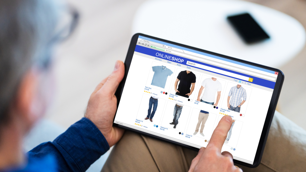
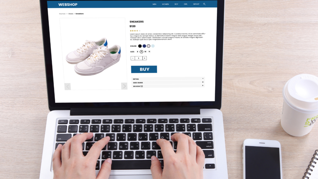
In the world of online shopping, your e-commerce website needs to look great and work smoothly whether people visit it on a mobile device or a desktop computer. To ensure this, it’s crucial to test your website on various devices. You want to make sure that everything, from your words and images to videos and how the website looks, remains consistent and visually appealing.
Lots of people use their smartphones or tablets to shop online. So, it’s not just a good idea but a necessity to make sure your website is mobile-friendly. If your website doesn’t adapt well to smaller screens and touch controls, you might lose out on many potential customers.

When you’re testing on different devices, pay attention to everything that makes your website look good and work well. Check if your product descriptions, buttons, and the way you talk about your brand are just as effective on a small screen as they are on a big one. Make sure that pictures and videos load quickly and still look good on all screen sizes. And see if your website layout adjusts nicely to fit different screens while keeping things looking neat and easy to use.
Consistency is important. No matter the device someone uses, they should have a smooth experience. The way people navigate your site, search for products, and buy them should be easy and make them feel comfortable.
Remember that it’s not just about how your customers see your site; it’s also about how search engines like Google see it. They prefer websites that work well on mobile devices, so making your site mobile-friendly can boost your website’s visibility in search results.
6. Streamline the Purchase Pathway
Running a successful e-commerce website involves ensuring that adding products to the cart and completing the checkout process is straightforward and hassle-free for your customers. This process is crucial, and any complications can deter potential buyers. To create a positive experience, take the time to review this process and identify anything that might confuse or frustrate your customers, such as obstacles, distractions, or clutter on your website.
This process should be like a well-marked path in a physical store, guiding customers smoothly from browsing to purchase. Similarly, your online checkout process should be clear and easy to navigate. Unnecessary steps or confusing elements can lead to customers abandoning their shopping carts, which is something you want to avoid.
During your evaluation, look at the entire journey from adding items to the cart to completing the purchase. Are there any steps that seem confusing or repetitive? Is there information or distractions that might divert your customers’ attention away from making a purchase? Review the design and layout to ensure they are user-friendly and intuitive.

A cluttered or confusing checkout process can cause customers to hesitate or leave without buying anything, harming your conversion rates. It’s crucial to focus on creating a clean and simple purchase pathway that instills confidence in your customers and encourages them to complete their purchases.
Consider involving real customers or potential users in your evaluation process. Their feedback can provide valuable insights into any issues they encounter while navigating the checkout process. This practical input can help you identify areas that need improvement or simplification.
7. Simplify Email and SMS Sign-Ups
Staying connected with your customers is essential in the e-commerce world. Two vital ways to do this are through welcome flows and building your email or SMS list. To make it easy for visitors to join your list, consider using a well-designed, clutter-free, and concise pop-up. This will encourage more people to subscribe, which can be a valuable asset for your e-commerce brand.
Welcome flows give you a chance to introduce your brand, greet visitors, and engage with them right from the start. This first impression can shape how visitors view your brand.

Now let’s talk about your email or SMS list. By joining your list, customers are saying they’re interested in getting updates, special offers, and exclusive content from your brand. It’s a direct way to connect, nurture leads, boost sales, and build loyalty.
To keep growing this list, consider using a well-designed pop-up. When it’s simple and easy to use, it makes it a breeze for visitors to sign up. Clear visuals, short and sweet messages, and an easy process can encourage more people to subscribe, bringing in new prospects.
You can also time the pop-up to appear when it makes the most sense, like after a visitor has spent some time on your site or looked at specific products. This makes it more likely that they’ll sign up.
Quickly Boost Your Conversions with These 7 Quick Wins for Your Shopify Store
By dedicating time to assess and enhance these seven crucial aspects of your e-commerce website, you can significantly improve your online business. Whether it’s refining your messaging, highlighting high-profit products, ensuring smooth navigation, fixing broken links, optimizing for different devices, simplifying the purchase process, or facilitating email and SMS sign-ups, these steps can make a huge difference.
Take the time to implement these improvements, and you might be pleasantly surprised by the positive impact on your e-commerce success.
Want help taking your e-commerce store to the next level? Click here to learn more about Brandhopper Digital and see if your business is a good fit to work with us!
